A well-designed dashboard serves as the control center for any application, providing users with critical insights and functionality in a single view. Whether it's a SaaS platform, an analytics tool, or an enterprise system, dashboards must be intuitive, data-driven, and easy to navigate.
Poorly designed dashboards overwhelm users with cluttered layouts, excessive data, and confusing navigation, leading to frustration and inefficiency. The key to an effective dashboard UX lies in balancing simplicity with functionality, ensuring users can access what they need quickly and effortlessly.
This blog explores the principles of intuitive dashboard design, best practices, and the latest trends shaping user experiences in data-driven applications.
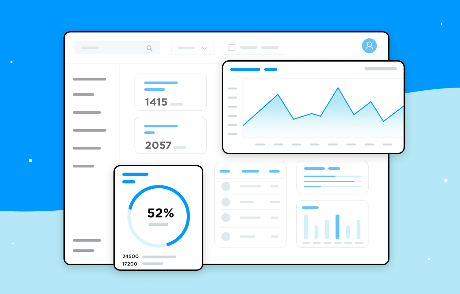
Image Credits - Justinmind
The Importance of Intuitive Dashboard UX
1. Enhancing User Efficiency
Dashboards should enable users to find information and complete tasks without unnecessary friction. A streamlined design reduces the time spent searching for insights, improving productivity.
2. Reducing Cognitive Load
Users shouldn't feel overwhelmed by excessive data or complex layouts. An intuitive dashboard simplifies decision-making by presenting only the most relevant information in an easily digestible format.
3. Improving Decision-Making
Data visualization plays a crucial role in helping users interpret trends, anomalies, and performance metrics at a glance. Well-structured dashboards turn raw data into actionable insights.
4. Strengthening User Engagement
A visually appealing and user-friendly dashboard keeps users engaged, increasing retention rates for apps and platforms that rely on frequent user interactions.
Key Principles of Intuitive Dashboard Design
1. Clarity Over Complexity
An intuitive dashboard is designed for clarity. Every element should have a clear purpose, ensuring users can quickly grasp information without unnecessary distractions.
Best Practices:
- Use concise labels and descriptions.
- Avoid jargon or technical terms that may confuse users.
- Highlight key metrics with bold typography and color differentiation.
2. Prioritize the Most Important Information
Users should immediately see the most critical data upon logging in. A well-structured dashboard prioritizes essential information based on user needs.
How to Achieve This:
- Use data hierarchy. Place high-priority metrics at the top.
- Display real-time data updates to maintain relevance.
- Provide a customizable dashboard where users can pin key widgets.
3. Use Data Visualization Effectively
Numbers alone don’t tell a story. Charts, graphs, and visual elements make complex data easier to interpret and act upon.
Best Data Visualization Techniques:
- Bar charts and line graphs: Ideal for tracking trends over time.
- Pie charts: Best for comparing proportions.
- Heatmaps: Useful for identifying patterns in large datasets.
- Progress indicators: Help users track goals and completion rates.
4. Maintain Consistent UI Elements
Consistency in design elements—colors, fonts, icons, and button placements—enhances user familiarity and reduces the learning curve.
Key UI Consistency Practices:
- Stick to a cohesive color scheme that aligns with brand identity.
- Use the same typography across all sections for readability.
- Keep navigation menus and interaction patterns uniform.
5. Simplify Navigation
A dashboard should not feel like a maze. Users should be able to access different sections with minimal effort.
Effective Navigation Strategies:
- Implement a clear and concise sidebar or top navigation bar.
- Use breadcrumb trails for multi-step processes.
- Limit the number of clicks needed to access key features.
6. Enable Customization and Personalization
Not all users need the same information. Allowing customization ensures that each user gets the most relevant insights.
Customization Features:
- Drag-and-drop widgets for personalized layouts.
- Filters to refine displayed data.
- Dark mode and theme options for user preference.
7. Optimize for Different Devices
A dashboard should provide a seamless experience across desktops, tablets, and mobile devices.
Mobile Optimization Tips:
- Use responsive design principles.
- Minimize heavy data loads to improve speed.
- Adjust layouts dynamically for smaller screens.
8. Provide Contextual Help and Onboarding
Even the most intuitive dashboard benefits from guided user support.
Ways to Assist Users:
- Include tooltips for unfamiliar terms or metrics.
- Offer an interactive walkthrough during the first use.
- Provide access to a help center or chatbot for instant support.
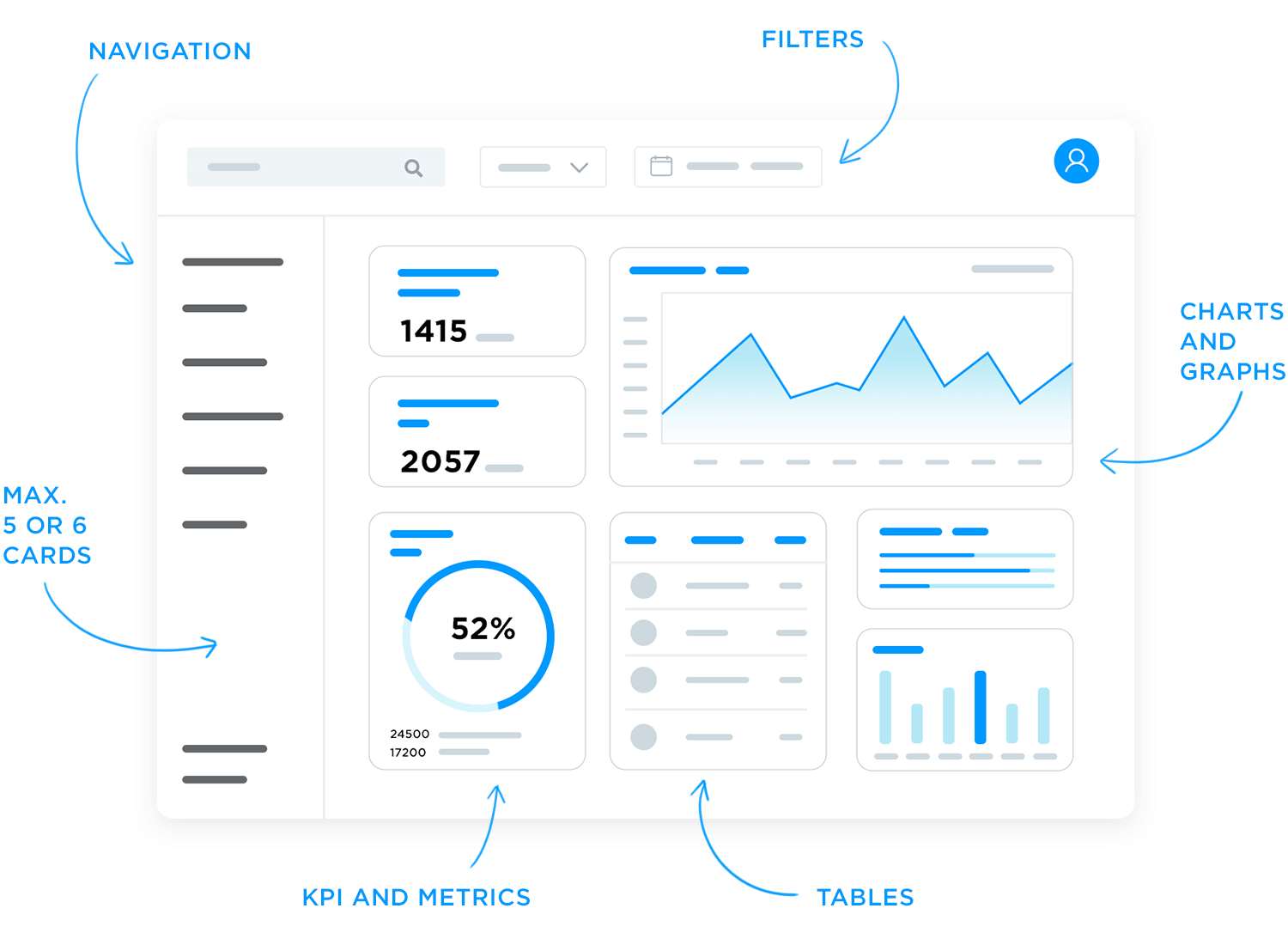
Image Credits - Justinmind
What you'll learn:
- Learn from industry experts and master practitioners.
- Engage in hands-on, project-based learning experiences.
- Connect with a vibrant community of creatives and professionals.
- Receive a certificate to boost your portfolio and credentials.
Latest Trends in Dashboard UX Design
1. AI-Powered Insights
Dashboards are becoming more intelligent, using machine learning to provide predictive analytics and automated recommendations.
Example: AI-driven dashboards can highlight anomalies in sales data and suggest corrective actions.
2. Minimalist Design and Dark Mode
Modern dashboards favor clean, distraction-free interfaces with the option for dark mode to reduce eye strain.
Example: Google Analytics' latest UI update focuses on minimalism with high contrast elements.
3. Voice and Gesture Controls
As voice assistants grow in popularity, dashboards are integrating voice commands for hands-free data retrieval.
Example: Enterprise dashboards that allow users to ask, “What were our top sales regions last quarter?”
4. Real-Time Data Streaming
For industries like finance and e-commerce, real-time dashboards offer live data updates to improve decision-making speed.
Example: Stock market trading platforms display second-by-second price fluctuations.
5. Gamification Elements
Adding interactive and engaging elements like progress tracking and achievement badges can boost user engagement.
Example: Fitness dashboards reward users with badges for hitting exercise milestones.
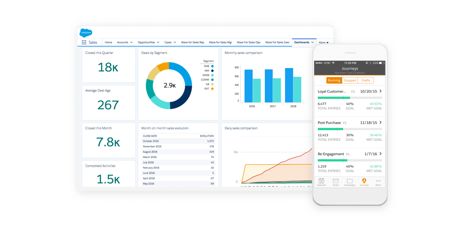
Image Credits - GoodFirms
Common Mistakes to Avoid in Dashboard UX
1. Overloading Users with Data
Too much information on one screen leads to decision fatigue. Focus on essential metrics and allow deep dives for detailed analysis.
2. Lack of User Testing
Designing without user feedback can result in a dashboard that doesn’t align with actual needs. Conduct usability tests to refine the interface.
3. Poor Data Labeling
Unclear labels or ambiguous metric names confuse users. Ensure every chart, table, and widget has a clear title and description.
4. Ignoring Performance Optimization
Slow-loading dashboards frustrate users. Optimize data queries and use caching techniques to enhance speed.
Conclusion
An intuitive dashboard UX is essential for enhancing user productivity, simplifying decision-making, and improving overall engagement. By focusing on clarity, data visualization, consistency, and customization, designers can create dashboards that users love.
As technology advances, integrating AI, voice commands, and real-time data will further revolutionize dashboard experiences. The key to success is continuous user feedback and iterative improvements, ensuring the interface remains functional, efficient, and visually appealing.
Level up your UI/UX skills! Learn to create stunning interfaces and seamless user experiences with our Advanced UI/UX Design Course. Boost your career and design products that stand out.
Enroll today at Kaarwan for more insights!
FAQs
1. What makes a dashboard intuitive?
An intuitive dashboard presents relevant data clearly, simplifies navigation, and minimizes cognitive load, ensuring users can quickly find what they need.
2. How can I improve the user experience of a dashboard?
Focus on clear data visualization, logical information hierarchy, customizable features, and a clutter-free layout to enhance usability.
3. What are the best tools for designing a dashboard UX?
Popular tools include Figma, Adobe XD, Sketch, and dashboard libraries like Chart.js and D3.js for data visualization.
4. How do I balance simplicity and functionality in a dashboard?
Prioritize essential metrics, use collapsible sections for advanced data, and offer customization options so users can tailor their experience.
5. What are the latest trends in dashboard UX design?
Current trends include AI-driven insights, voice-controlled dashboards, real-time data updates, dark mode options, and gamification elements.